Logo & Branding
Red Mirror Studios is the independent media studio reshaping how cybersecurity is seen, felt, and understood. Their content lives where culture lives — YouTube, TikTok, and Instagram — with a cinematic home base on the web.
The goal with their branding was to create a video-first brand that differentiated heavily from the current cybersecurity landscape. Ultimately, Red Mirror should look more like a cinematic studio than a cyber firm. That meant no clean blues, futuristic fonts, or “trust” language. The design had to be minimal and elegant.
LOGO & STYLE GUIDE
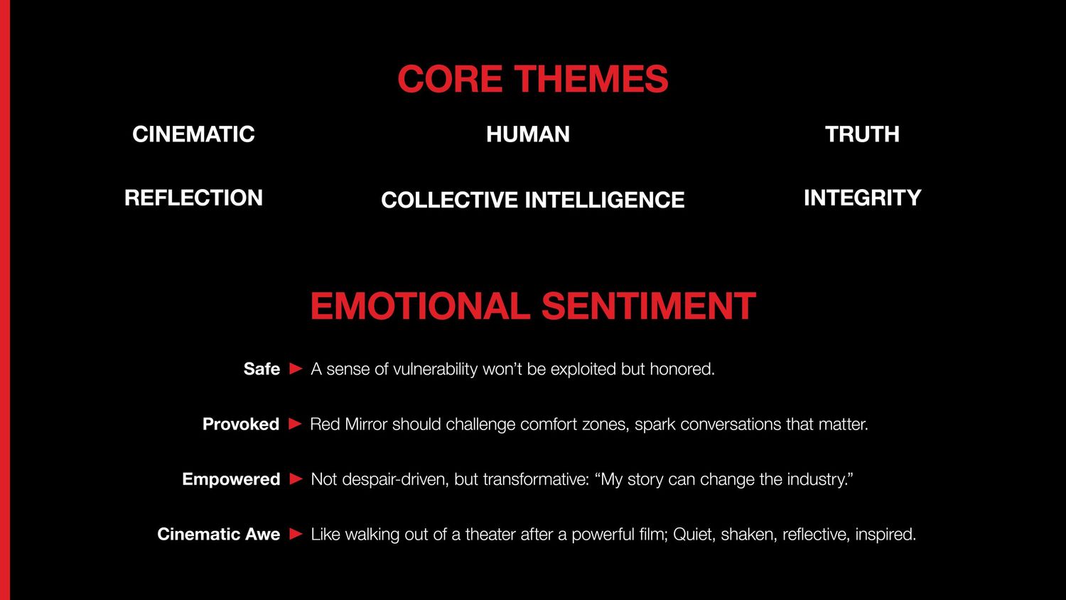
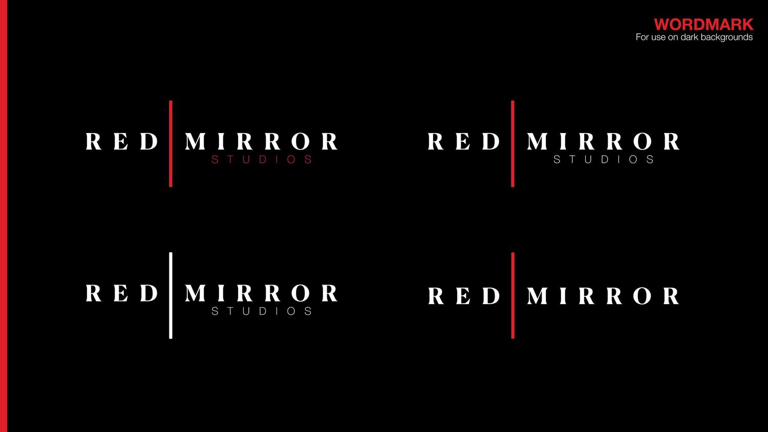
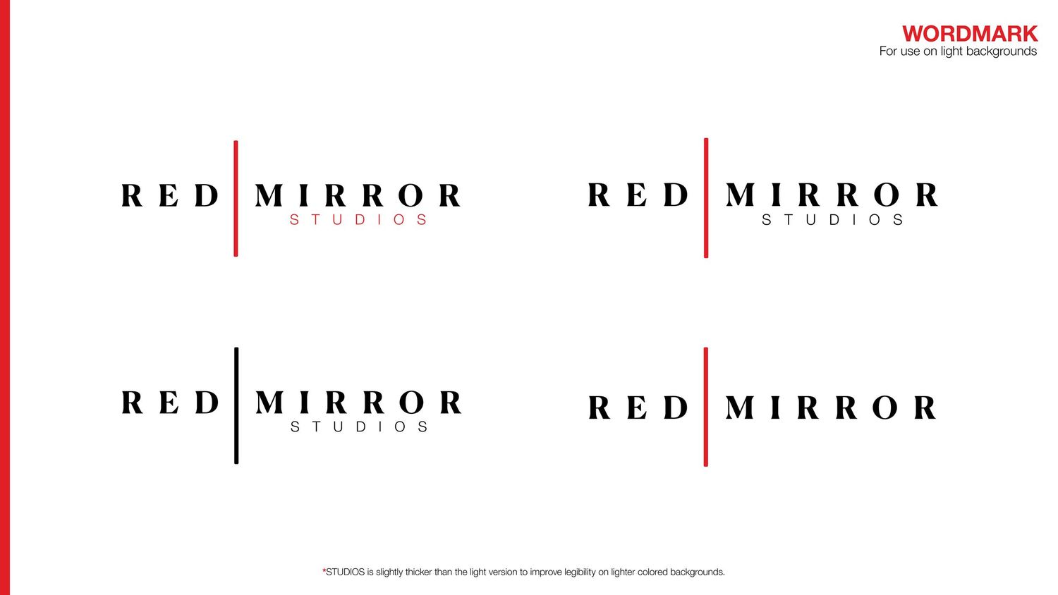
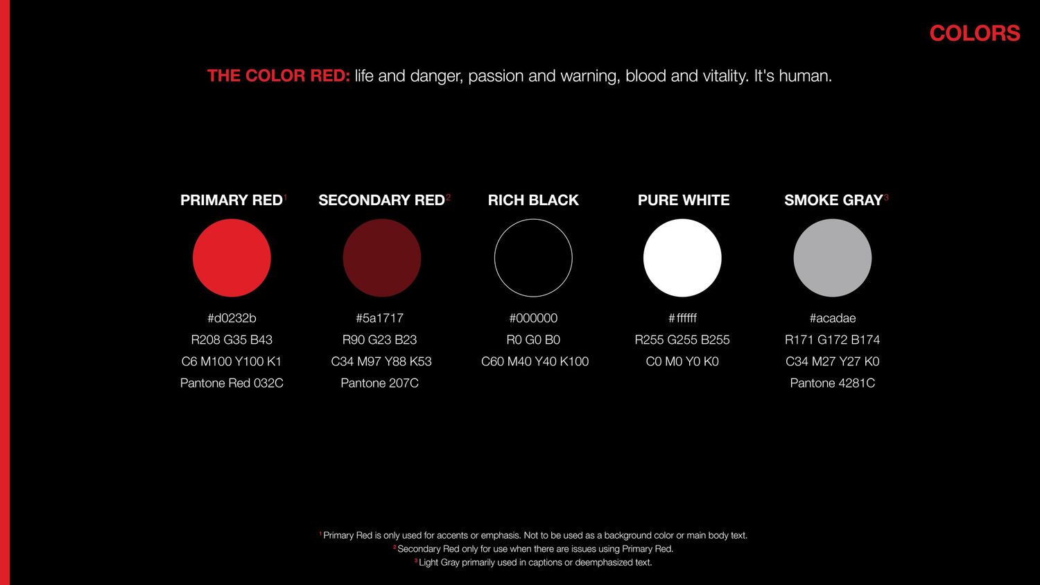
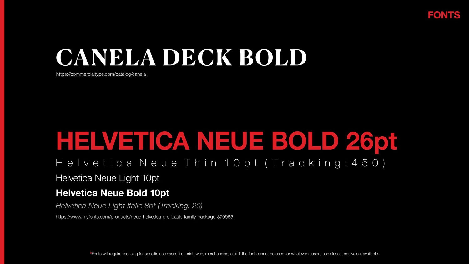
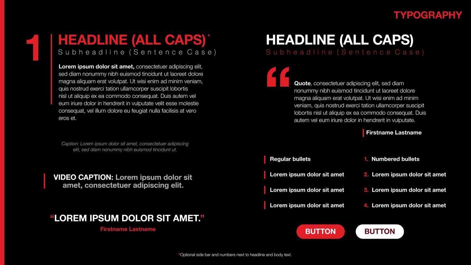
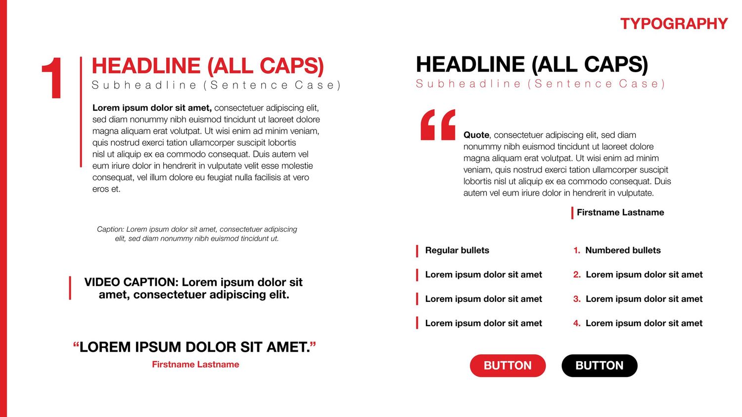
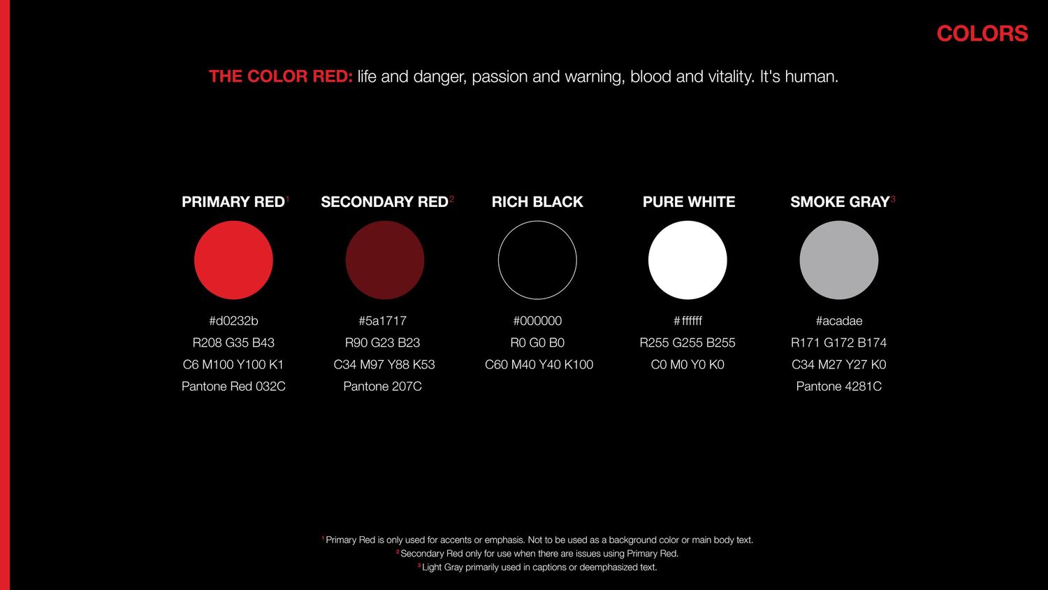
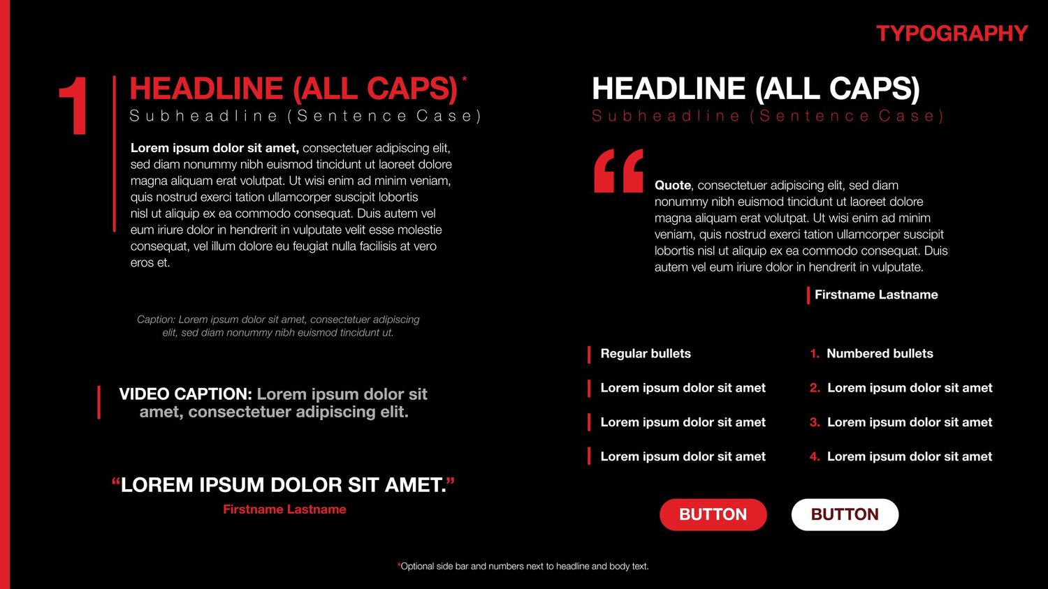
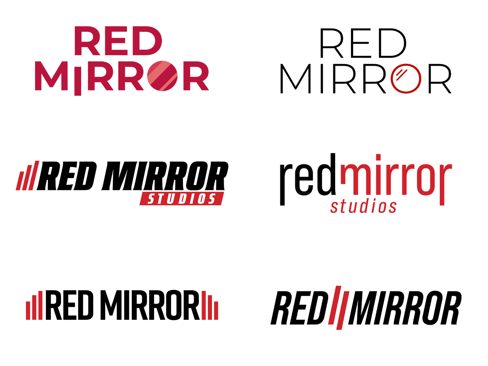
As we explored what Red Mirror Studios really meant at its core, we explored multiple minimalist designs. We were mainly attracted to the dichotomy of "red" and "mirror". The composition felt stronger when the two words contrasted with each other: creating visual separation through different font weights, colors, or use of lines between the words.
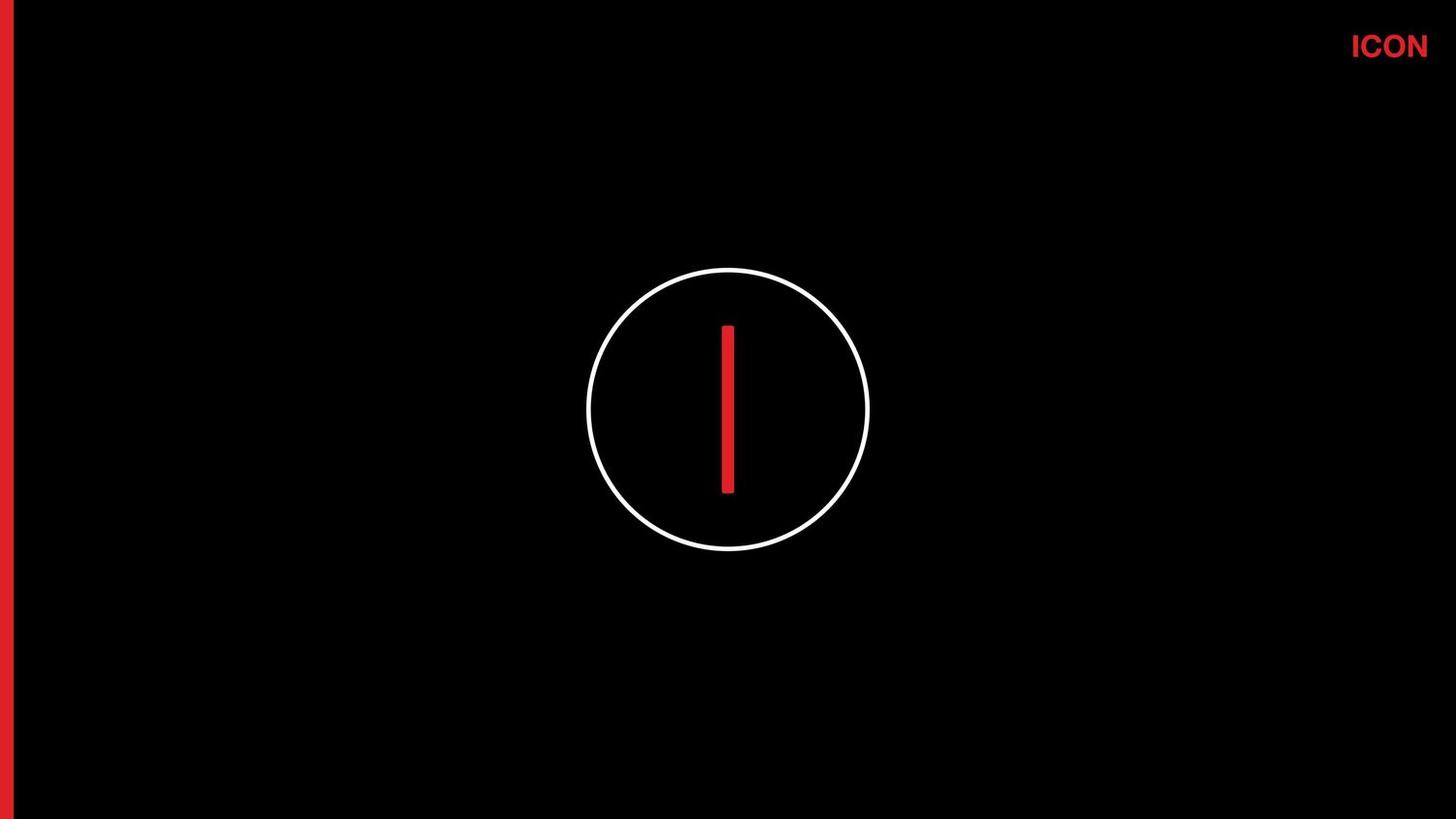
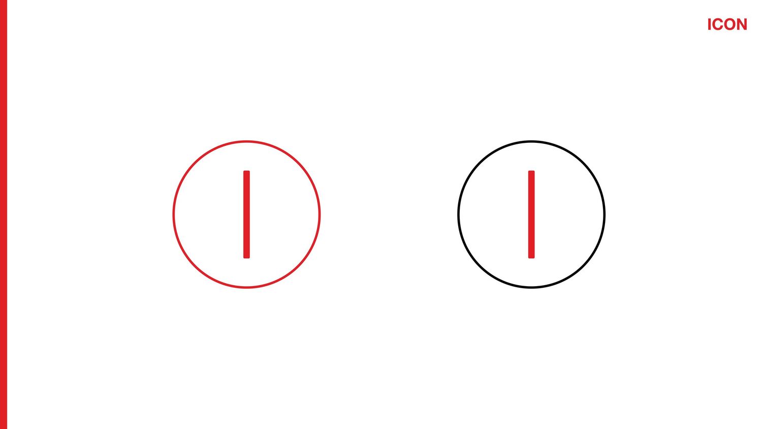
The use of lines and circles was representative of the lens or mirror through which we examine the world. Red Mirror, at its core, is about reflection, truth, and facing what’s real. The mirror is not about vanity, but confrontation.
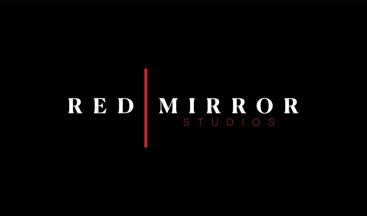
We ultimately landed on a wordmark that appeared more elegant in nature. The brand's striking boldness would be illustrated more through color and imagery instead. The thinner typefaces and lines introduced a more cinematic feel. The brand's icon simply uses a shortened version of the stroke encompassed by a circle.